

CLEAR CUT VIEW
Why less is truly more
My thoughts on the power of minimalist design.

By
By
David Ayan
David Ayan
published on
published on
Friday 18 July 2025
18 Jul 2025
Designing products is often about solving problems, but most of the time the biggest challenge is doing less, less clutter, fewer distractions. I've come to appreciate that minimalist design isn't just an aesthetic trend, it's a natural form that brings clarity to complexity. When I first started out in design, I thought that more was always better, but through deeper thought and research, I realised that excessive content can be overstimulating and can lead to confusion. Minimalism in design means stripping away all unnecessary features, so users can truly focus on what truly matters.
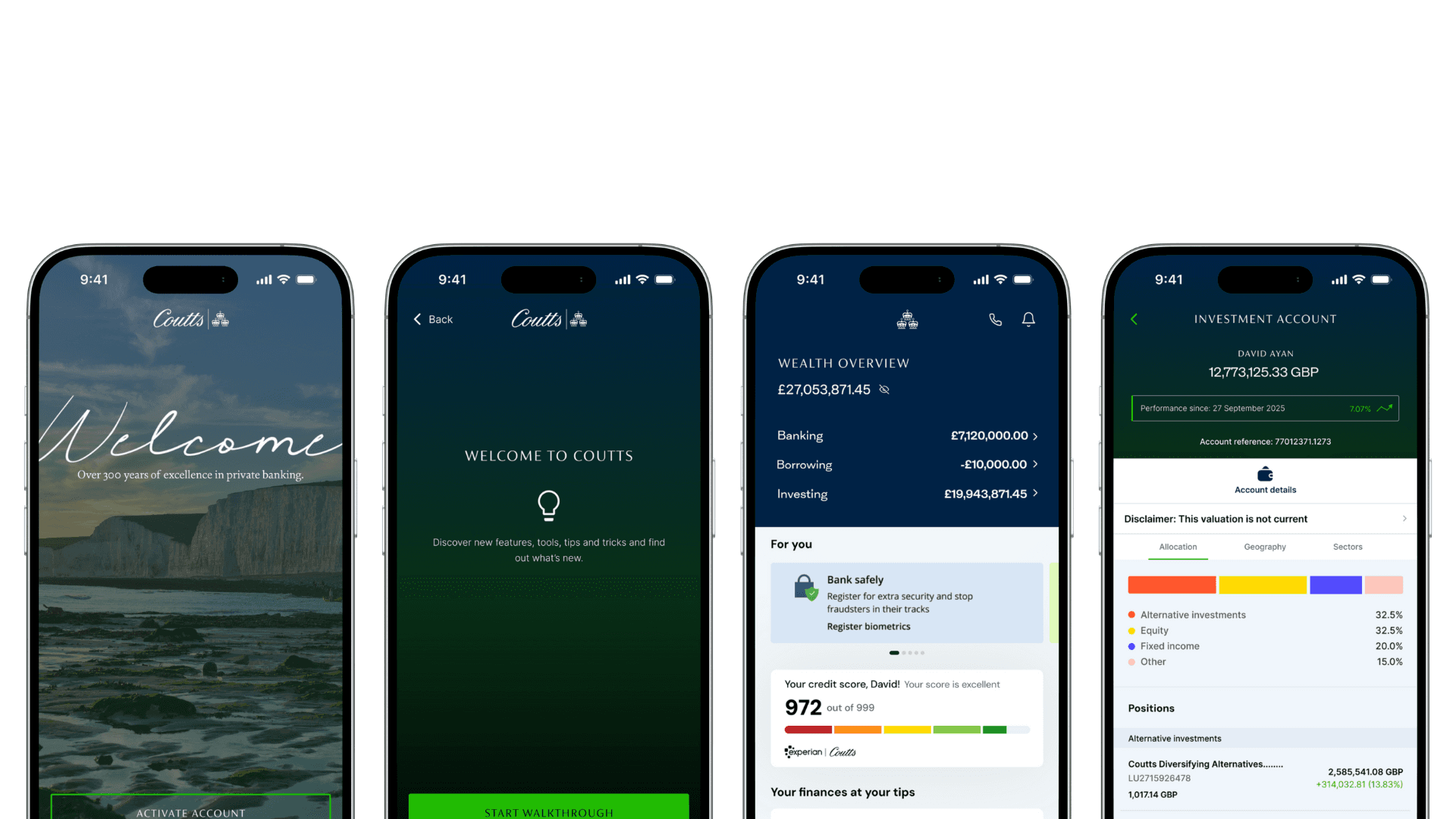
Achieving minimalism is a genuine challenge for most designers, especially me. However, when minimalism is done right, it can make the digital experience feel effortless, approachable and as if it were second nature. In the Coutts - Campbell Project, I faced the challenge of simplifying the private banking experience for affluent clients with complex wealth positions and on-demand needs.
I approached the challenge by designing low-fidelity wireframes focused purely on structure and flow, no icons, ornaments or decorations.
Minimalist design requires discipline and a great deal of critical thinking, so I've learnt on my journey. It requires the designer to side aside what they think is cool, and focus on the necessary, asking the tough questions such as "what is essential?" or "what truly will help and serve the users and their goals?". This mindset has pushed me to think more carefully. When I approached the Coutts redesign, I had to focus on what really mattered most to clients. I gathered substantial research to ascertain that all affluent clients want a one-stop shop for wealth management, where they can access, view and control their overall wealth at a glance. So I had to cut the noise and also maintain a sense of exclusivity and a premium feel.
Designing products is often about solving problems, but most of the time the biggest challenge is doing less, less clutter, fewer distractions. I've come to appreciate that minimalist design isn't just an aesthetic trend, it's a natural form that brings clarity to complexity. When I first started out in design, I thought that more was always better, but through deeper thought and research, I realised that excessive content can be overstimulating and can lead to confusion. Minimalism in design means stripping away all unnecessary features, so users can truly focus on what truly matters.
Achieving minimalism is a genuine challenge for most designers, especially me. However, when minimalism is done right, it can make the digital experience feel effortless, approachable and as if it were second nature. In the Coutts - Campbell Project, I faced the challenge of simplifying the private banking experience for affluent clients with complex wealth positions and on-demand needs.
I approached the challenge by designing low-fidelity wireframes focused purely on structure and flow, no icons, ornaments or decorations.
Minimalist design requires discipline and a great deal of critical thinking, so I've learnt on my journey. It requires the designer to side aside what they think is cool, and focus on the necessary, asking the tough questions such as "what is essential?" or "what truly will help and serve the users and their goals?". This mindset has pushed me to think more carefully. When I approached the Coutts redesign, I had to focus on what really mattered most to clients. I gathered substantial research to ascertain that all affluent clients want a one-stop shop for wealth management, where they can access, view and control their overall wealth at a glance. So I had to cut the noise and also maintain a sense of exclusivity and a premium feel.